Statistics (pictograms, bar charts & line graphs): Desert Heat
The Problem
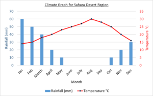
A climate graph (like the one shown opposite) is a special type of graph that shows what the climate of a particular location on Earth is like. A climate graph combines two sets of data – the location’s monthly rainfall and the location’s average monthly temperature. The temperature is always shown as a line graph and the rainfall is always shown as a bar chart.
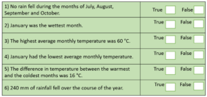
Working with a partner, can you identify which of the statements (opposite) about the Sahara Desert climate graph are true and which are false? Discuss how you know.

Did you know?
Although our planet looks like a watery blue marble from space, one-third of Earth’s land surface is partially or totally desert.
Visualising the Problem and Getting Started
Statements: